

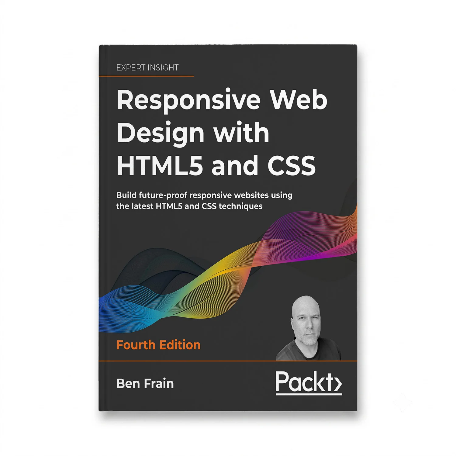
author: Ben Frain (Author)
edition: 4th ed.
language: English
publisher: SitePoint
dimensions: 7.5 x 0.81 x 9.25 inches
ISBN-10: 193638972X
ISBN-13: 978-1936389724
publication date: March 1, 2013
print length: 432 pages
Discover the secrets to creating responsive web designs that work seamlessly on any device. This comprehensive guide takes you through the latest HTML5 and CSS techniques, ensuring your websites are not only modern but also future-proof. Learn about fluid layouts, media queries, and more, empowering you to build dynamic and engaging user experiences.
Key features include:
– Step-by-step tutorials for designing responsive web pages
– Best practices for optimizing content for mobile devices
– Techniques for creating accessible and inclusive websites
– Code samples and practical examples to enhance your skills
Highlight the benefits of this book by emphasizing its ability to help developers save time, improve user engagement, and stay ahead in a rapidly evolving digital landscape.