
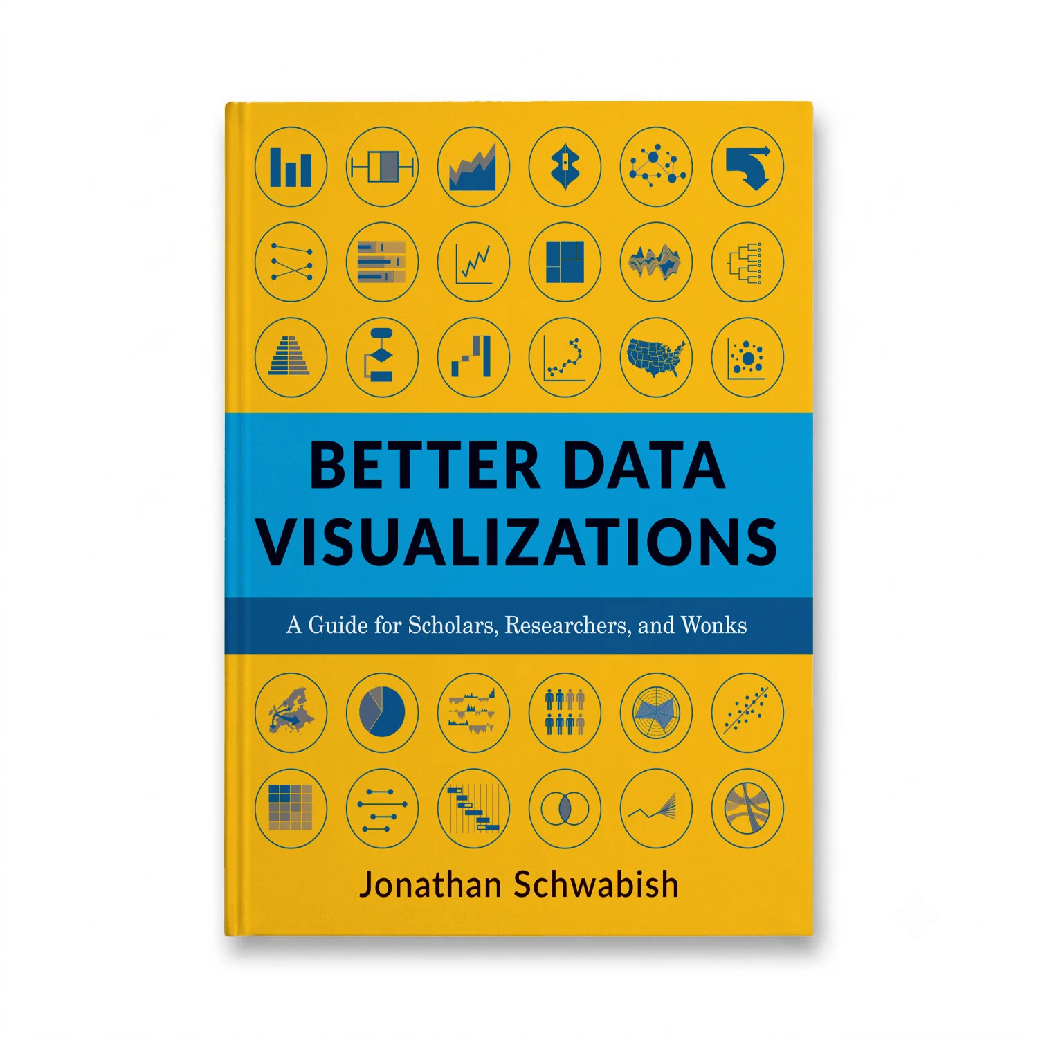

Better Data Visualizations: A Guide for Scholars, Researchers, and Wonks by Jonathan Schwabish is an essential resource for anyone tasked with presenting complex data in a clear and engaging manner. The book, published by Columbia University Press on February 9, 2021, delves into the nuances of effective data visualization, offering practical strategies to enhance scholarly work and research outputs.
With over five hundred examples and an exploration of more than eighty different visualization types—from histograms to horizon charts, ridgeline plots to choropleth maps—Schwabish covers a broad spectrum of visual tools. He guides readers through the foundational principles of visual perception and provides insights into making subjective style decisions that can significantly impact how data is perceived.
Throughout the book, Schwabish emphasizes the importance of considering your audience and defining clear communication goals. He walks readers step-by-step through the process of selecting the most appropriate graph type for their specific data set, ensuring that every visualization serves its intended purpose effectively.
Whether you are a seasoned researcher looking to refine your skills or a novice eager to start creating impactful visualizations, this guide is an invaluable resource. It equips readers with the knowledge and tools necessary to create compelling and effective data visualizations that can resonate deeply with their audience.
The 464-page book is designed to be accessible and comprehensive, making it suitable for both individual study and as a reference for teams working on collaborative projects. Its focus on practical applications ensures that readers will find the information useful in real-world scenarios, from academic papers to professional reports.